Python + pandas + matplotlib vs. R + tidyverse - a quick comparison
TL;DR
When I started this blog post, my intention was to compare basic data wrangling and plotting in Python and R. I write most of my code in Python, doing mostly scientific stuff, data wrangling, basic statistics and plots. However, although the pandas framework has been built to resemble R's data.frame class, the functional programming style that R provides with the tidyverse - or rather with the %>% operator of the magittr package - often give a way more natural feeling when handling data.
To be honest, I was sure, that the tidyverse packages would out-perform pandas; however, looking at the code snippets now, I must admit that the difference is less obvious than I previously thought. Still, in more complex situations, Python code - in comparison - looks more verbose, while R seems to be more concise and consistent.
Plotting may be a different story, but to make a fair comparison here, I would have to take the variety of plotting libraries into account that the Python ecosystem offers, however this would be far out of the scope of this post.
The ggplot2 package on the other hand, has been developed as an implementation of"Grammar of Graphics", a philosophy by Leland Wilkinson that divides visualizations into semantic components. This implementation provides an huge flexibility, as we'll see later.
Setting it up
Traditionally, the popular iris data set is used to demonstrate data wrangling, but in the given situation let's play around with the Johns Hopkins University COVID-19 data from github. As an example, the time series of global confirmed cases can be accessed here.
Let's set up our working environments and load the three data sets confirmed, recovered and deaths in R and Python.
R:
library(tidyverse)

base_url <- "https://raw.githubusercontent.com/CSSEGISandData/COVID-19/master/csse_covid_19_data/csse_covid_19_time_series/"
confirmed <- read.csv(paste0(base_url, "time_series_covid19_confirmed_global.csv"))
recovered <- read.csv(paste0(base_url, "time_series_covid19_recovered_global.csv"))
deaths <- read.csv(paste0(base_url, "time_series_covid19_deaths_global.csv"))

head(confirmed)

##   Province.State      country.Region      Lat     Long X1.22.20 X1.23.20   ...
## 1                        Afghanistan  33.0000  65.0000        0        0
## 2                            Albania  41.1533  20.1683        0        0
## 3                            Algeria  28.0339   1.6596        0        0
## 4                            Andorra  42.5063   1.5218        0        0
## 5                             Angola -11.2027  17.8739        0        0
## 6                Antigua and Barbuda  17.0608 -61.7964        0        0
## ...
Python:
import pandas as pd

base_url = "https://raw.githubusercontent.com/CSSEGISandData/COVID-19/master/csse_covid_19_data/csse_covid_19_time_series/"
confirmed = pd.read_csv(base_url + "time_series_covid19_confirmed_global.csv")
recovered = pd.read_csv(base_url + "time_series_covid19_recovered_global.csv")
deaths = pd.read_csv(base_url + "time_series_covid19_deaths_global.csv")

confirmed.head()

#   Province/State Country/Region      Lat     Long  1/22/20  1/23/20  1/24/20  ...
# 0            NaN    Afghanistan  33.0000  65.0000        0        0        0  ...
# 1            NaN        Albania  41.1533  20.1683        0        0        0  ...
# 2            NaN        Algeria  28.0339   1.6596        0        0        0  ...
# 3            NaN        Andorra  42.5063   1.5218        0        0        0  ...
# 4            NaN         Angola -11.2027  17.8739        0        0        0  ...
So far, so similar. When looking at the loaded data sets, we see that the format is kind of ugly. These are time series with names of states and countries in the first two columns, latitude and longitude coordinates in the third and forth, and one column per day for the following rest of the set, containing the numbers of confirmed / recovered / deaths reported for the country/region.
To make working with the data easier, I want to transform them to a long format, having a single column date with all the dates and a column confirmed (or recovered and deaths respectively) with the corresponding number of cases.
In R we could do the following:
confirmed_long <- confirmed %>%
  pivot_longer(
    c(-`Province.State`, -`Country.Region`, -Lat, -Long),
    names_to="date",
    values_to="confirmed") %>%
  mutate(date = as.Date(date, format = "X%m.%d.%y"))

head(confirmed_long)

##   Province.State Country.Region   Lat  Long date       confirmed
##   <fct>          <fct>          <dbl> <dbl> <date>         <int>
## 1 ""             Afghanistan       33    65 2020-01-22         0
## 2 ""             Afghanistan       33    65 2020-01-23         0
## 3 ""             Afghanistan       33    65 2020-01-24         0
## 4 ""             Afghanistan       33    65 2020-01-25         0
## 5 ""             Afghanistan       33    65 2020-01-26         0
## 6 ""             Afghanistan       33    65 2020-01-27         0
very similarly in Python:
confirmed_long = pd.melt(
    confirmed,
    id_vars = ["Province/State", "Country/Region", "Lat", "Long"],
    var_name = "date",
    value_name = "confirmed")\
    .assign(date = lambda x: pd.to_datetime(x.date))

confirmed_long.head()

#   Province/State Country/Region      Lat     Long       date  confirmed
# 0            NaN    Afghanistan  33.0000  65.0000 2020-01-22          0
# 1            NaN        Albania  41.1533  20.1683 2020-01-22          0
# 2            NaN        Algeria  28.0339   1.6596 2020-01-22          0
# 3            NaN        Andorra  42.5063   1.5218 2020-01-22          0
# 4            NaN         Angola -11.2027  17.8739 2020-01-22          0
As you can see, I took the opportunity to also parse the strings in the date column to datetime. While in R we can pipe the output of the previous command into the next with the %>% operator, we achieve a very similar affect using pandas' assign function.
We can do the same with the remaining two data sets. However, we have plenty of redundant information, since all three data sets will be the same apart from the confirmed, reconvered and deaths columns. So let's merge them into one data frame.
Also I don't care about single provinces and states but rather want to sum up the data country-wise. This will mess up our latitudes and longitudes, so I just drop them here.
R:
covid_long <- confirmed_long %>%
  left_join(recovered_long) %>%
  left_join(deaths_long) %>%
  select(-Lat, -Long, -Province.State) %>%
  group_by(Country.Region, date) %>%
  summarise_all(sum)
Python:
covid_long = pd.merge(
    pd.merge(
        confirmed_long,
        recovered_long,
        how="left"),
    deaths_long,
    how="left"
)
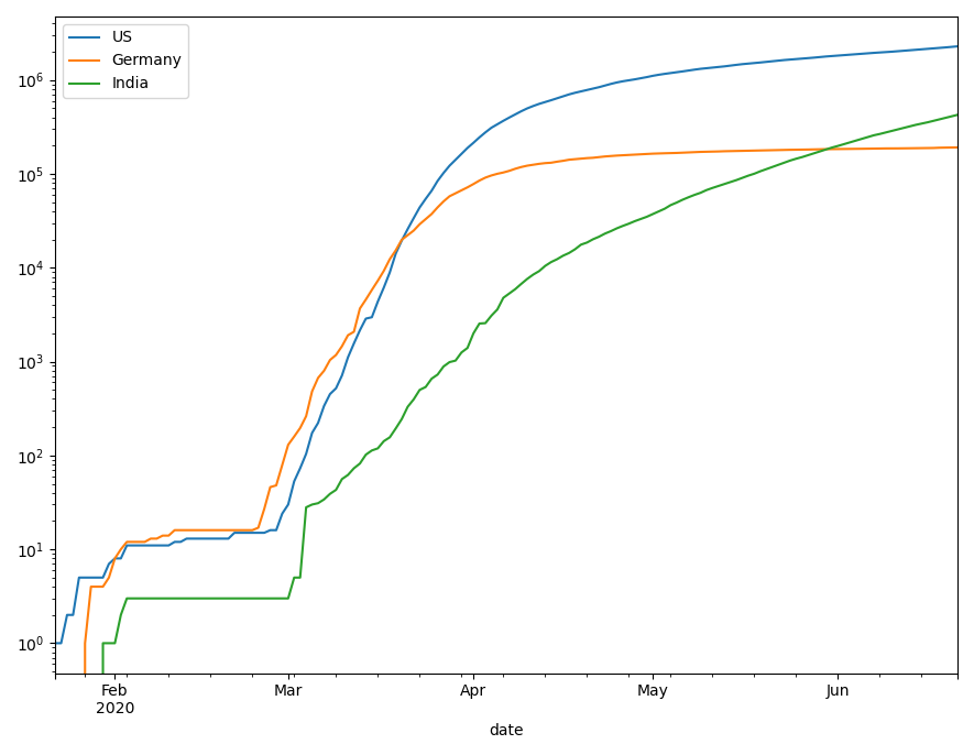
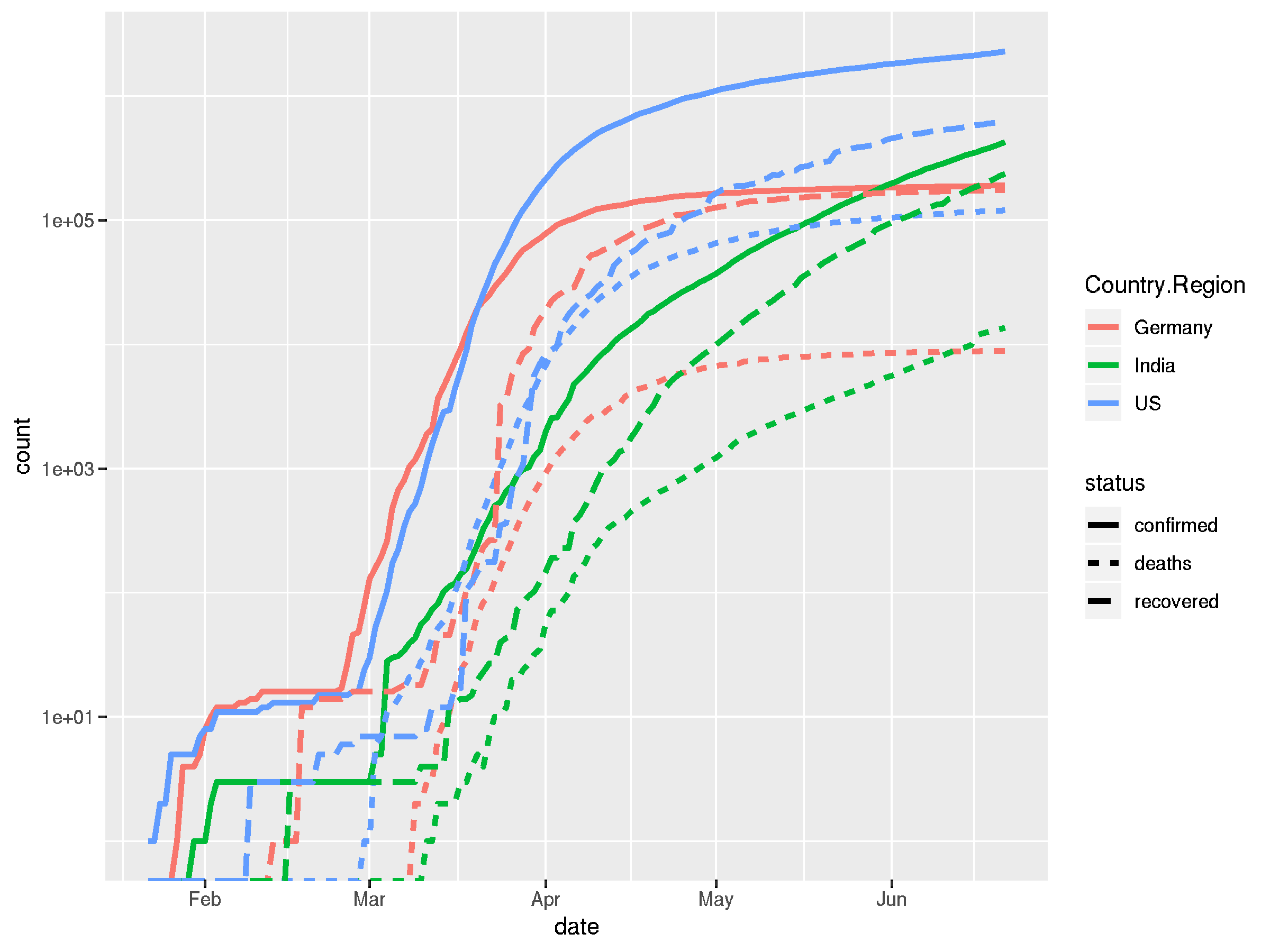
We're ready to look at some plots. I would like to see a line plot that shows us the numbers of confirmed, recovered and death cases against the time, on a log transformed scale. Different countries should be coded in colors, the confirmed, recovered and deaths lines should be coded in line styles.
Let's have a look at the Python code first:
# first I merge the three data sets into one, drop some columns
# I'm not interested in and sum the numbers by country, as I don't
# want to look at specific states here.

covid_long = pd.merge(
    pd.merge(
        confirmed_long,
        recovered_long,
        how="left"),
    deaths_long,
    how="left")\
    .drop(["Lat", "Long"], axis = 1)\
    .groupby(["Country/Region", "date"])\
    .sum()\
    .reset_index()

# I define a list of three countries I want to see in the plot

countries = ["US", "Germany", "India"]

# and set the y-scale of my axes object to log scale, since we expect
# exponential growth

fig, ax = plt.subplots()
ax.set_yscale('log')

for country in countries:
    covid_long.query('`Country/Region` == @country')\
              .plot(x="date", y="confirmed", ax=ax, label=country)
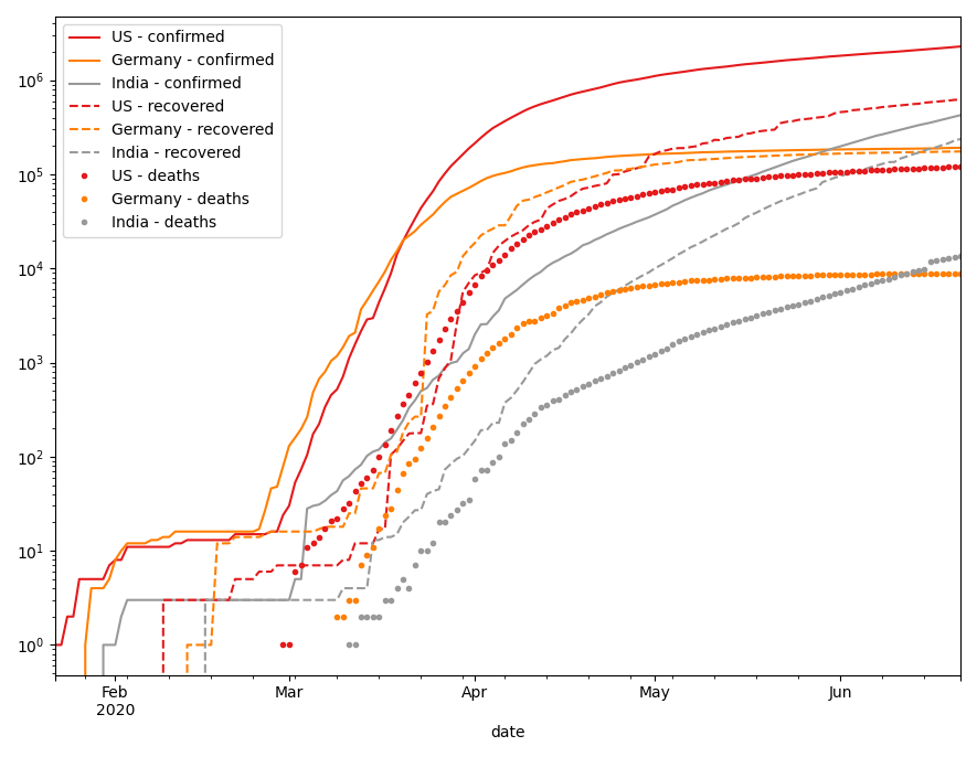
So far, these are just the numbers of confirmed cases. For plots in matplotlib, I know no better way than to plot the different countries sequentially or in a loop. To add the other cases, I add another loop.
# to plot confirmed, recovered and deaths cases in one plot
# we have to put a little effort into it

# we need a set of colors for our countries and a set of styles
# for the different status attributes

colors = plt.get_cmap('Set1', len(countries))

styles = ['-', '--', '.']

fig, ax = plt.subplots()
ax.set_yscale('log')

for i, status in enumerate(['confirmed', 'recovered', 'deaths']):
    for j, country in enumerate(countries):
        covid_long.query('`Country/Region` == @country')\
                        .plot(
                            x="date",
                            y=status,
                            label=f"{country} - {status}",
                            c=colors(j),
                            ax=ax,
                            style=styles[i])
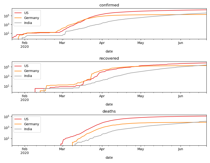
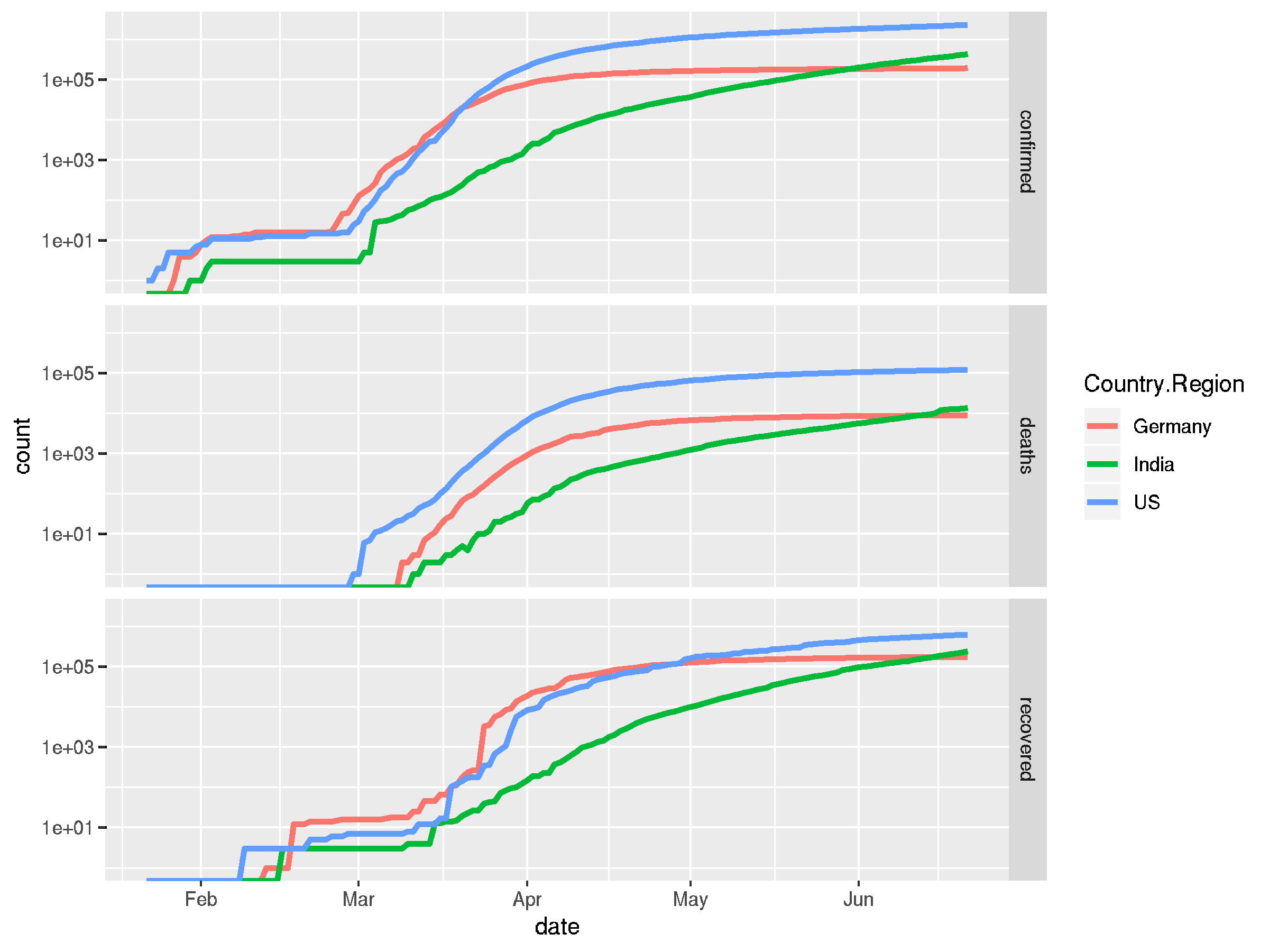
While this is a bit messy in a single plot, we can use multiple subplots instead of line style, to show different status.
# we can split this up into multiple subplots for better overview

fig, ax = plt.subplots(3, 1)

for i, status in enumerate(['confirmed', 'recovered', 'deaths']):
    ax[i].set_yscale('log')
    ax[i].set_title(status)
    for j, country in enumerate(countries):
        covid_long.query('`Country/Region` == @country')\
                        .plot(
                            x="date",
                            y=status,
                            label=f"{country}",
                            c=colors(j),
                            ax=ax[i])
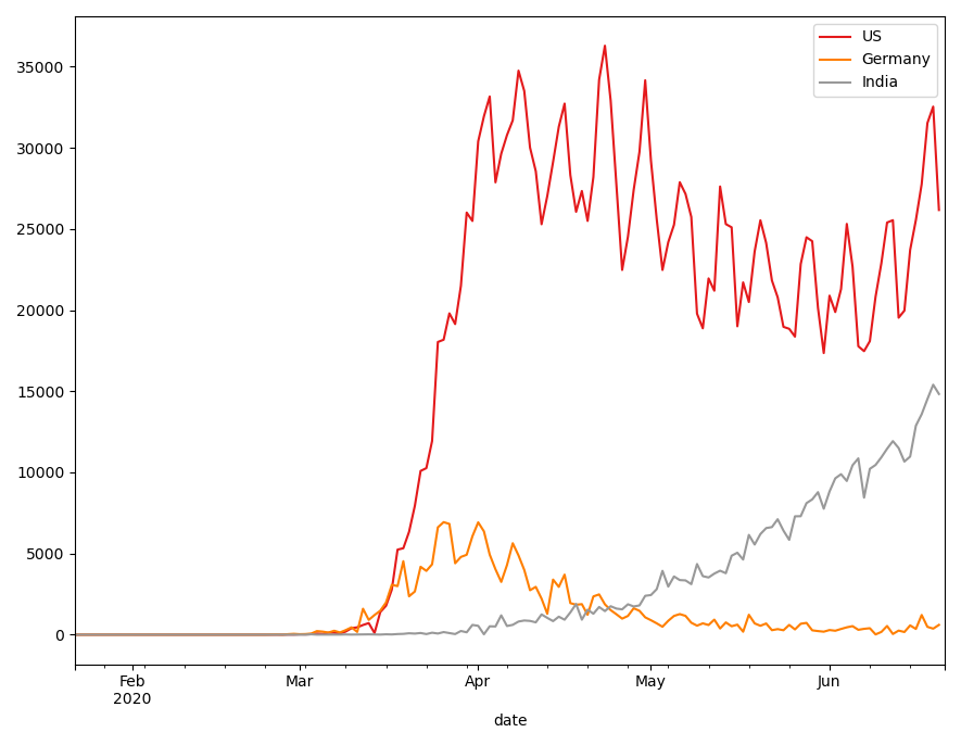
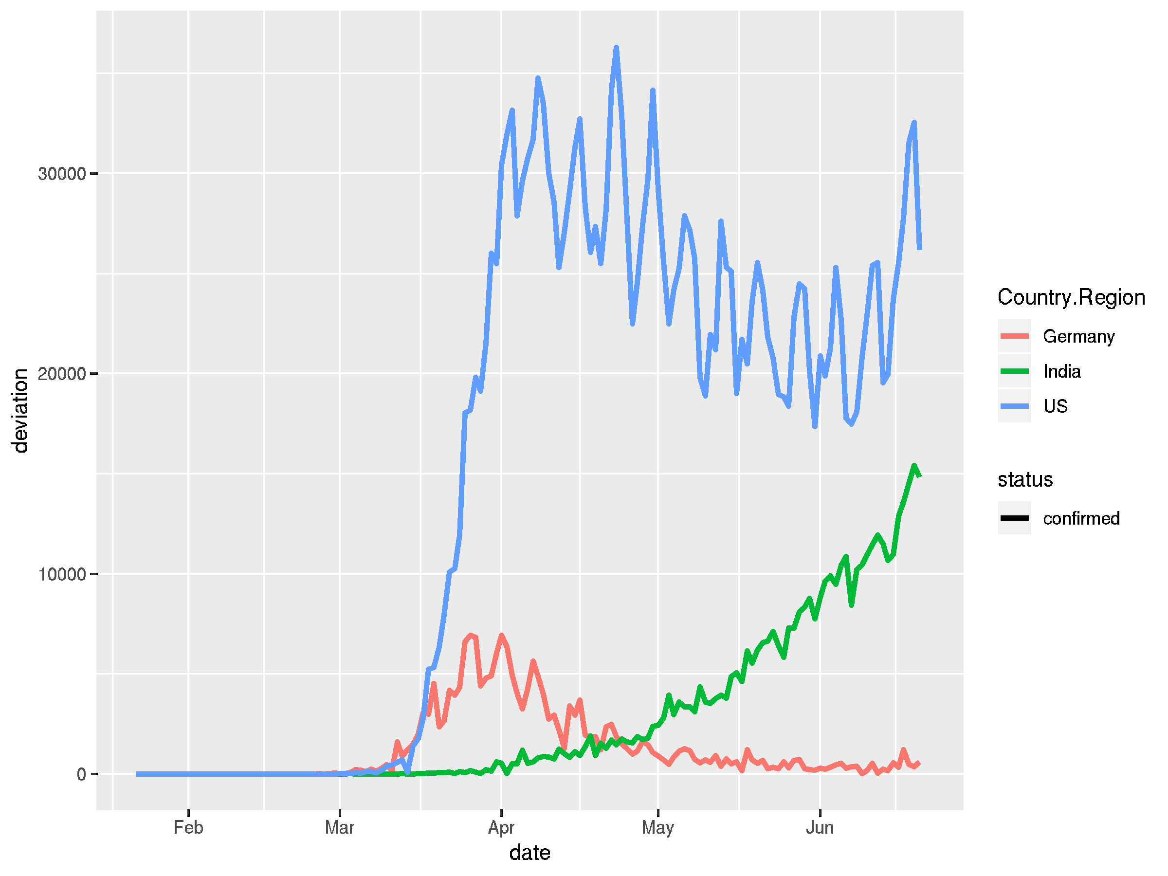
Finally, I want to compute the deviation of confirmed cases, to get the daily growth. Here's how I would do it with pandas:
# we pivot the table and compute the deviation. I don't know
# a more elegant way that to do it in multiple steps

covid_even_longer = pd.melt(
    covid_long,
    id_vars = ["Country/Region", "date"],
    var_name = "status",
    value_name = "count")

covid_even_longer.loc[:, 'lagged'] = (covid_even_longer\
                                      .sort_values(by=['date'], ascending=True)\
                                      .groupby(['Country/Region', 'status'])['count']\
                                      .shift(-1))

covid_even_longer = covid_even_longer\
    .assign(deviation = lambda x: x['lagged'] - x['count'])


fig, ax = plt.subplots()

for i, country in enumerate(countries):
    covid_even_longer.query('`Country/Region` == @country and status == "confirmed"')\
                    .plot(
                        x="date",
                        y="deviation",
                        label=country,
                        c=colors(i),
                        ax=ax)
So now to have a direct comparison, here's the tidyverse way to achieve the above results:
## we define a vector of countries we want to look at
countries <- c("US", "Germany", "India")

## plot the confirmed, recovered and deaths cases in one plot
## we again pivot our table and make use of ggplots aesthetics

covid_long %>%
  filter(Country.Region %in% countries) %>%
  pivot_longer(cols = c("confirmed", "recovered", "deaths"),
               names_to = "status",
               values_to = "count") %>%
  ggplot(aes(x = date, y = count, color = Country.Region)) +
    geom_line(aes(linetype = status), size = 1.2) +
    scale_y_log10()
## this looks a bit chaotic in a single plot, we can also use
## facet_grid to break this up into sub-plots

covid_long %>%
  filter(Country.Region %in% countries) %>%
  pivot_longer(cols = c("confirmed", "recovered", "deaths"),
               names_to = "status",
               values_to = "count") %>%
  ggplot(aes(x = date, y = count, color = Country.Region)) +
    facet_grid("status") +
    geom_line(size = 1.2) +
    scale_y_log10()
## it's easy to on-the-fly calculate a deviation to get daily
## change rates by groups and pipe the resulting dataframe into
## the plotting function again

covid_long %>%
  filter(Country.Region %in% countries) %>%
  pivot_longer(cols = c("confirmed", "recovered", "deaths"),
               names_to = "status",
               values_to = "count") %>%
  group_by(Country.Region, status) %>%
  mutate(deviation = lead(count) - count) %>%
  ungroup() %>%
  filter(status == "confirmed") %>%
  ggplot(aes(x = date, y = deviation, color = Country.Region)) +
    geom_line(aes(linetype = status), size = 1.2)
Summary
While there hardly any difference visible for simpler data transformations, merging and pivoting, the Python syntax becomes quite verbose when plotting slightly more complex data. The R workflow in contrast is straight forward, readable and arguably more beautiful.
Visualization in semantic letters allows to focus on what to show, not how. No loops necessary. It's not necessary to create as many temporary variables, since it simply doesn't take many extra steps to achieve what I want. Computing and adding new columns in my data frame is just done on the fly.
Of course, there is much more you can do with both libraries. I haven't touched theming at all, nor different plot types. However, this is a fairly common set-up that I have to deal with in my daily work, so although not a complete comparison, it should be a relevant one.

